Mobile Finacial App
PlutoPay
Role: Researcher, UX & UI design
What is the PlutoPay?
Why are we making it?
Tools: Figma, Adobe suite
Time: 90 days
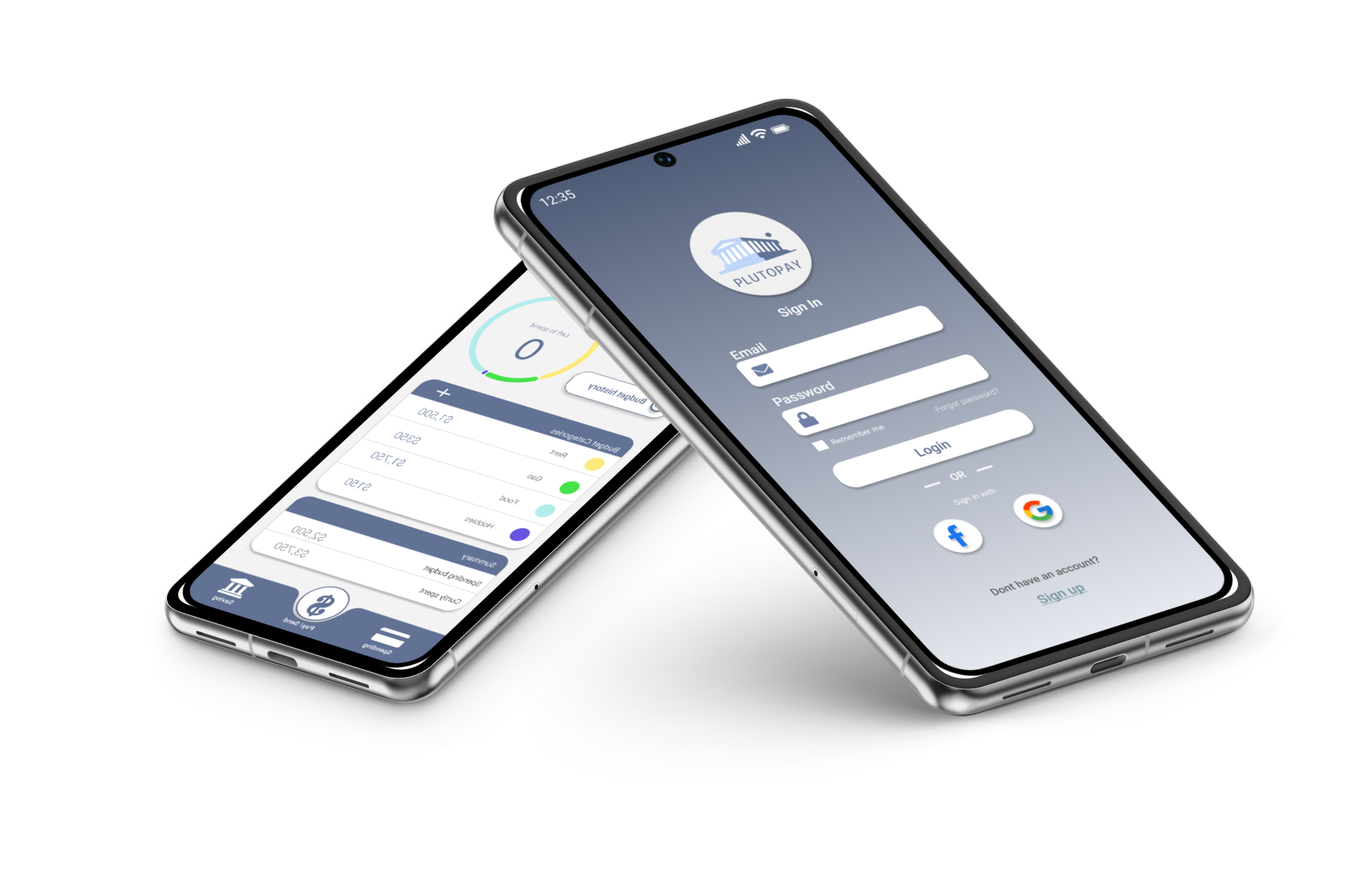
A financial app used to send and receive money
An app used for easy accessibility on the go
An app made to help users spend and budget their money wisely
Made for a younger audience
To help a younger generation of users with their finances
To gain better data about the market
To understand if there is a niche in the market for Plutopay
Inital Resurch
User interviews
How often do you find yourself using a financial app?
What do you use the most? and what is the function you use the most?
Has there ever been a bad experience you have faced while using apps like _?
What was the process like to clear up the issue? if any.
From your preferred application is there any quality of life updates/ actions that make it easy for you to conduct your business?
“I use paypal every day”
“I wish there was more transparency with my transactions”
“I use Chase it’s just to chek my balance”
Quotes like these made it easier to understand the audience I was designing the Plutopay app for. My initial interviews provided valuable insights that informed the creation of user personas and journeys. I decided to develop two distinct personas to represent two completely different potential users.
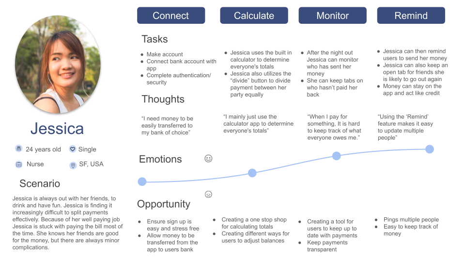
Jessica Persona
The social spender
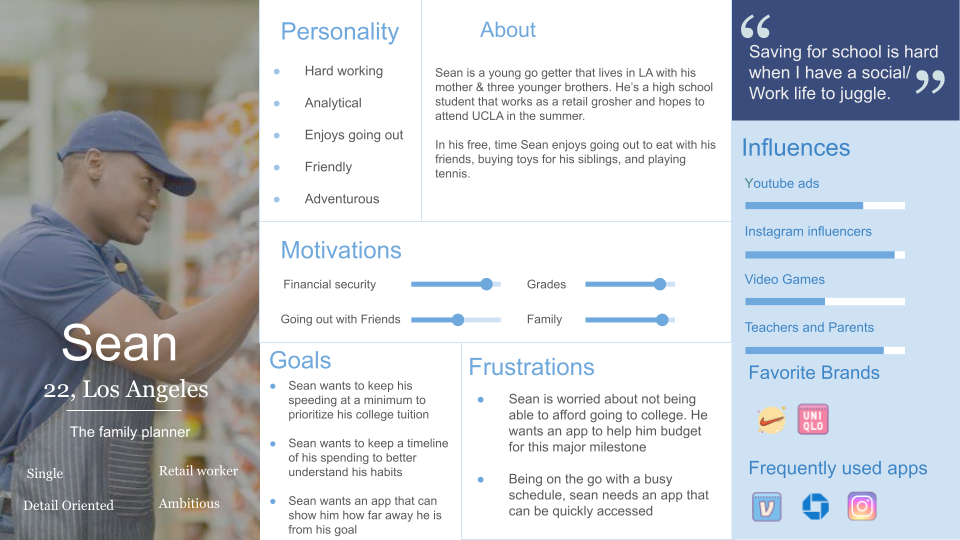
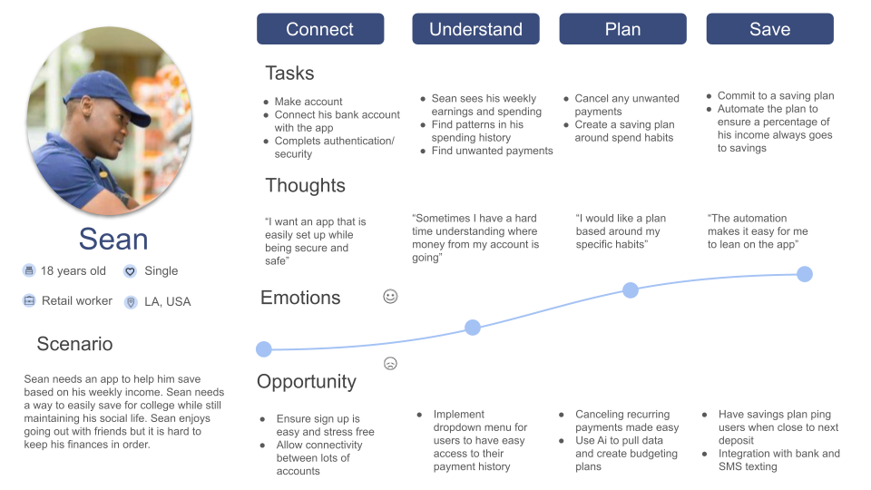
Sean Persona
The family planer
These personas provided valuable insights into the key tasks and functions that needed to be incorporated into the app
Jessica user Journey
Sean user Journey
User Journeys provide valuable insights into the challenges users might face while interacting with the app, allowing me to better empathize with their experiences and develop solutions tailored to their needs.
Majority of the users are tech savvy
80% of users are in their mid to late 20’s
Most only use the app on the go
Simple tasks are the most used features
Only in app for a few minutes/ not much time spent in app
Users struggle with accessing their finances efficiently and securely while on the go, leading to frustration and a need for a more streamlined solution.
Create an app called Plutoplay to reduce the time users spend on each action, streamlining tasks and flows for a more straightforward experience.
Resurch Findings
Problem
Goal
Initial Design
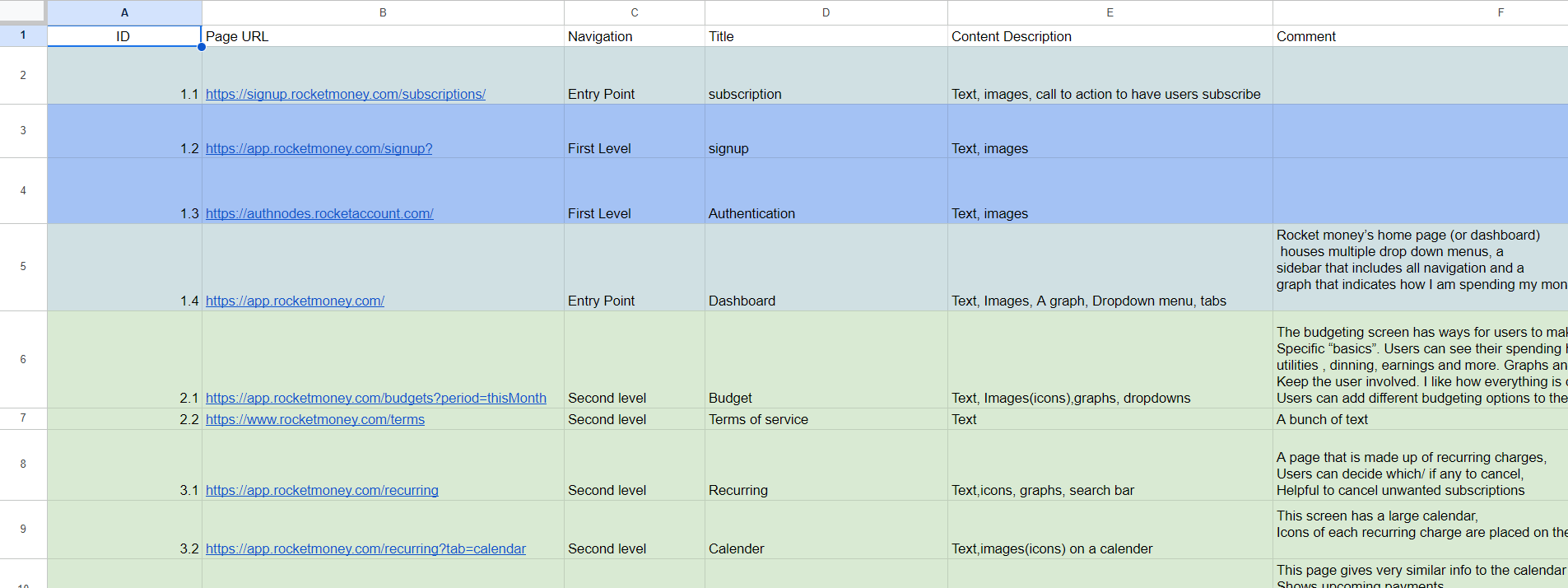
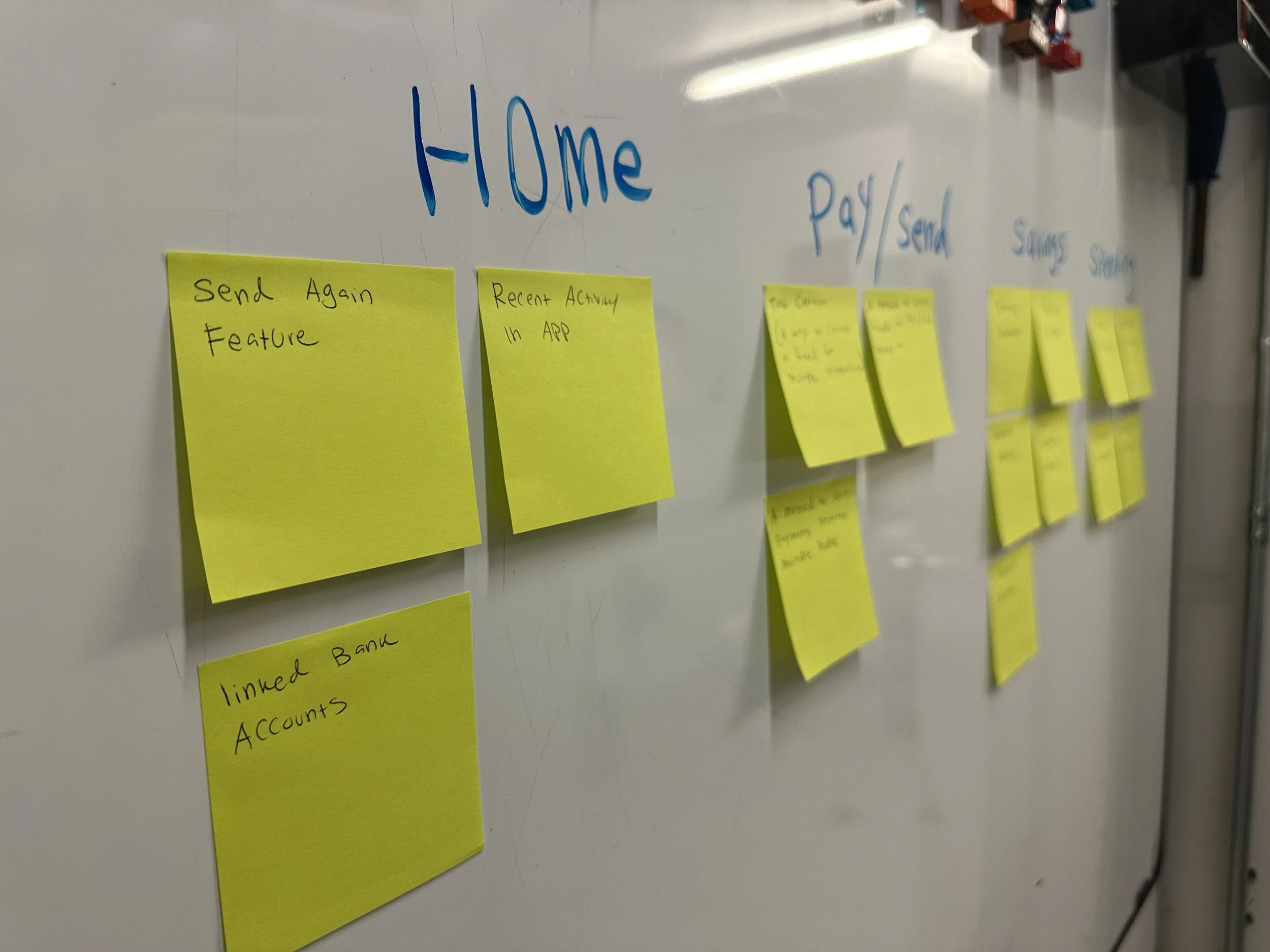
Before diving into the core of the design, the first step I took was to create a roadmap for the application. A sitemap ensures that all information is well-organized and easy to navigate, making everything intuitive for users. Below is the sitemap I created for Plutopay. Building on my initial design, I conducted a closed card sort with 11 participants, which guided the creation of this sitemap.
Sitemap
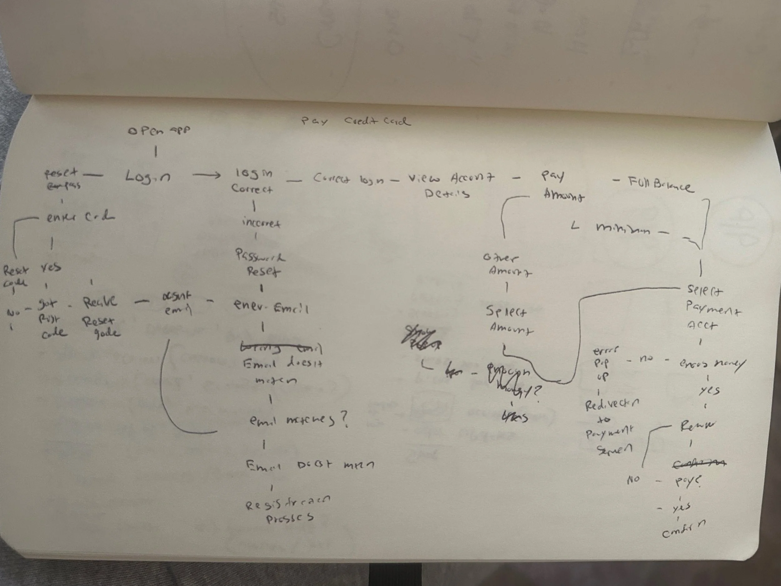
User flow sketches
As with much of my design process, I begin by sketching a basic layout on paper.
In this phase, I'm focusing on quickly understanding how users will navigate through each page of the app. Creating these user flows by hand allows for easy adjustments and refinements before transitioning to Figma.
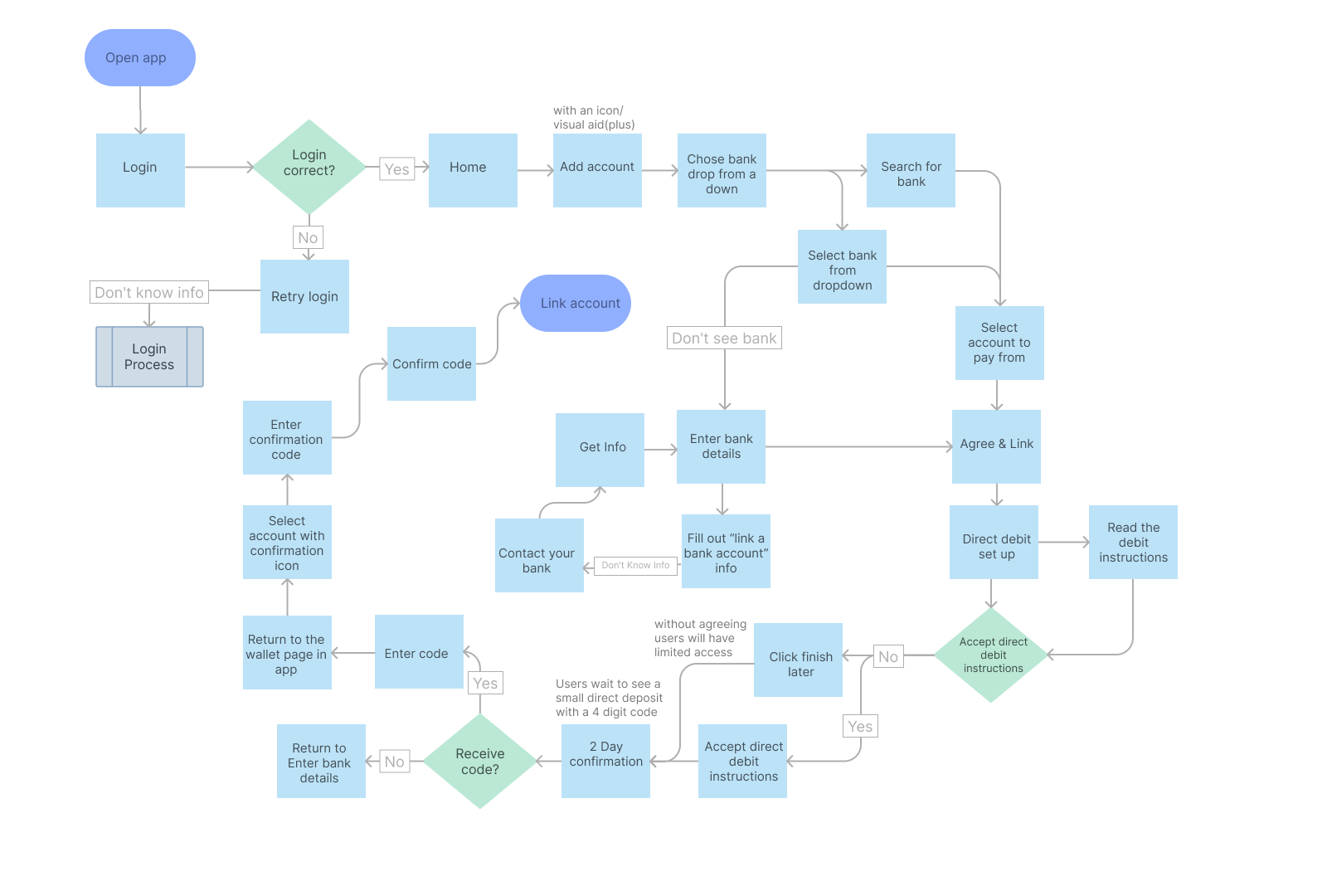
After skething in the sketchbook it is time to get into Figma. I use a combination of plugins to create flows that show the direct path a user takes to finish a single task in Plutopay.
Linking account flow
Send/Request flow
Both user flows were created using Figma, allowing me to gain a clearer understanding of what the final app will require. I add notes and helpful quotes in the margins to capture the details of each page and provide clear guidance for future revisions.
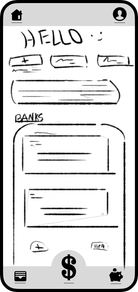
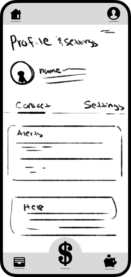
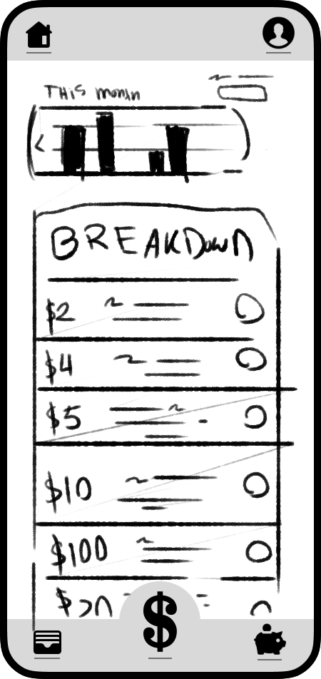
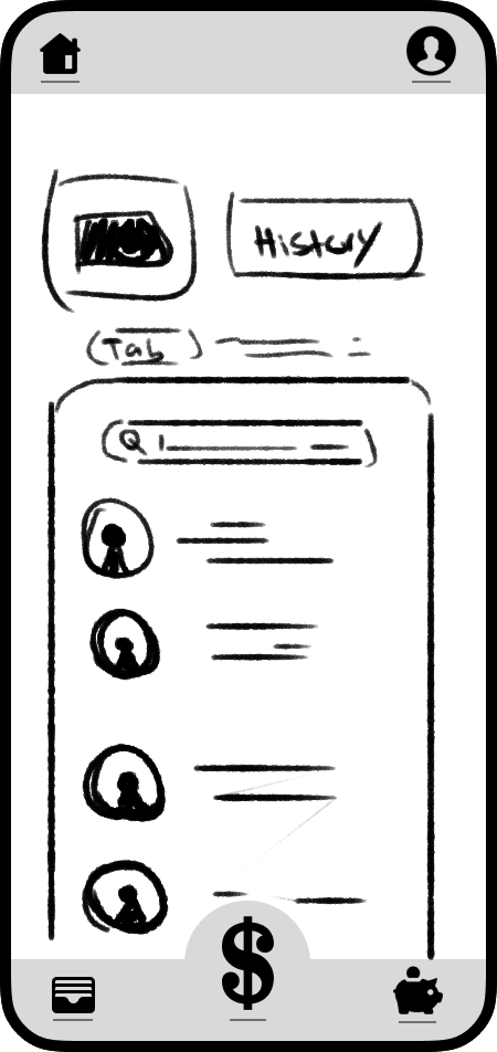
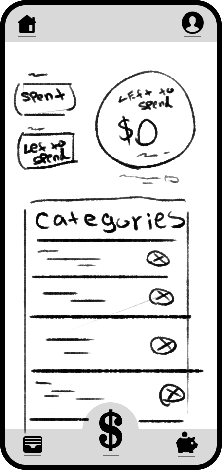
Initial design sketches
Just like the user flow sketches, I begin designing each screen of the Plutopay app by hand in a sketchbook. Each page quickly fills with ideas for layouts, text, and different arrangements of graphs or buttons.
This step is crucial to my process, as it allows me to explore a wide range of ideas and determine which designs both look and perform the best.
After organizing my thoughts in my sketchbook, I turn to Figma to create more defined wireframe designs. From there, I develop high-fidelity designs that are fully fleshed out and ready for prototyping and testing with potential users.
Wire-Frames
High-Fidelity prototype
Testing
Test questions
Task 1: split a pyement with a Friend “split a payment using your trasaction history”
Task 2: Check Your Recent Transactions "Please find and review your most recent transaction in the app."
Task 3: Create a new budget "Please set up a new savings tab in your already established budget."
"Small animated elements could bring a lot of life to this"
"How will it know my transaction history?"
"I saw the linked accounts button and didn't know I could add a new account"
After testing with five different users, I organized their feedback into a spreadsheet to better categorize and break down the data into manageable sections. This made it easier to refine my design based on their insights. Some of the key results are shown below.
Rainbow spredsheet
Findings
The home page was confusing for most testers to navigate
Some wordage was vague and hard to understand
Screens in app did’t follow google’s material design
Adding animations can make it more engaging for the user
Some interactions didn’t work as intended
Fount siszes where too small for some to confidently interat with
The primary color was used too much, which made it hard to distinguish key actions in the app
Iteration
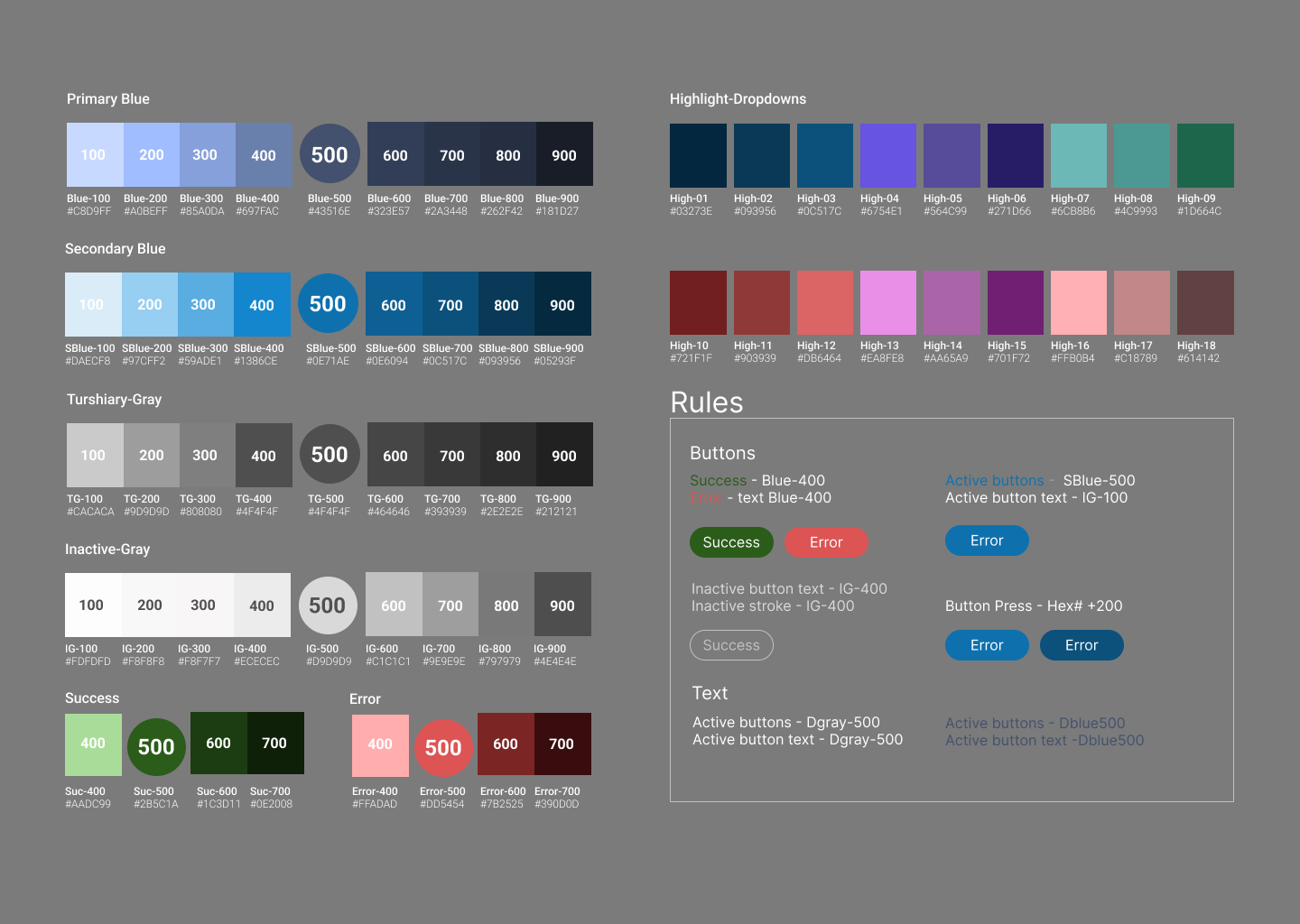
After conducting my user research, I focus on implementing changes and updates to the application. While refining my designs and correcting mistakes, I also create a style guide, ensuring both align with user feedback based on solid data.
Style Guide
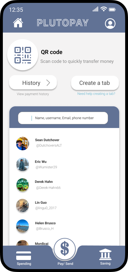
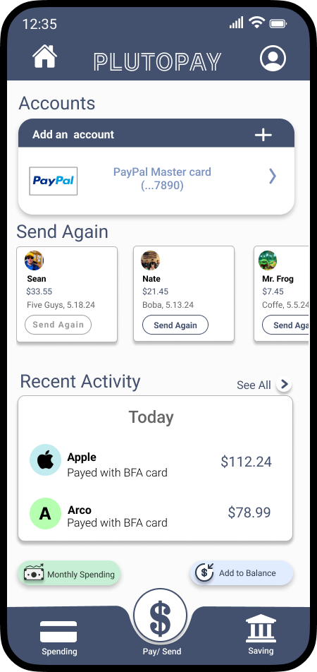
Home page iteration
Before
Before
Before
Adding a budget addition
created a lean design to lead the eye of the user to the most important parts of the screen
Accent with a secondary color
Reduce the amount of primary colors to create more visual intrest
Reduced the amount of clicks for the user by combining 2 previusly seprate screens
Accented primary actions with a secondary color
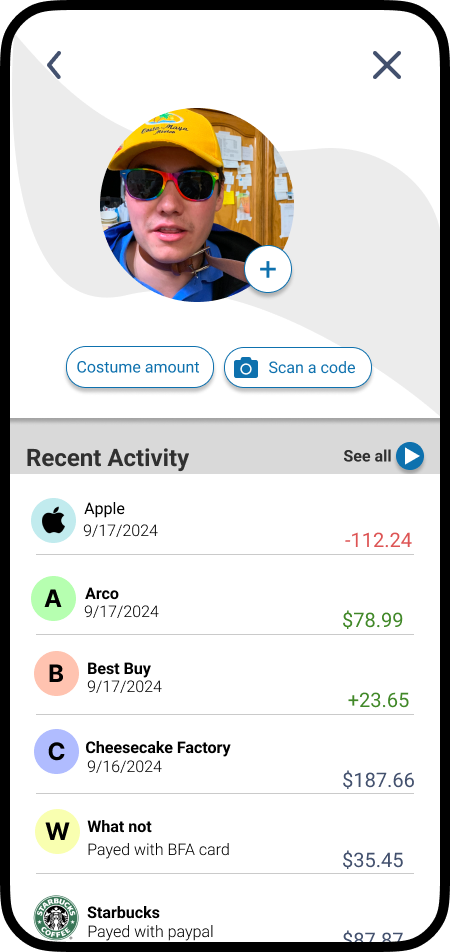
Made it easy for the user to interact with their payment history
Used plus icon to easily add new friends to the payment
Tester feedback voiced a consern about how they would add a budget
Because of this I created a new form for users to fill out to create a new budget
After
After
Sending Ideation
After
Going forward
Continued testing
After refining my initial design and creating a new user-friendly prototype, the next step is to gather additional feedback to validate my designs and ensure they are clearly understood by a new group of testers.
Continued Ideation
Similar to previous steps in the process, the next phase involves ideating based on the feedback from my testers. Conducting multiple usability tests and continuously refining their feedback is essential for creating a robust design that’s ready for development.
Development
One of the final steps in the process is handing off the design for development. At this stage, I collaborate closely with a developer, providing them access to all my assets and files. I make sure to highlight the key aspects of my design and work together with them to ensure they have everything they need to successfully develop the app.

