
The Process
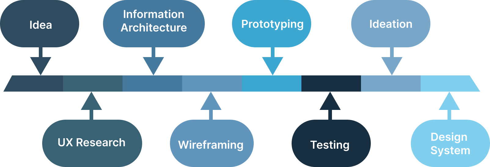
This project took about a month to complete. It started with sketches and initial ideas. After inital research, I created prototypes. Based on my tests, I developed a design system & High-fidelity wireframes in Figma.

PlutoPay was inspired by apps like Venmo and major banks like Chase and Wells Fargo. Our goal was to streamline user actions and solve pain points, like sending multiple payments at once and tracking past transactions.


Applications :
Involvement: Design, wireframe, prototyping
PlutoPay
Discover

User Interviews
Mathew: "I usually split payments when I'm on vacation with friends, but I always keep the receipts so I can track what everyone owes me later. Honestly, it gets pretty annoying."

Steven: "Venmo is great because no strings are attached. I can send money quickly and be done with it."
Olivia: "Some payments go through while others don’t. I have no idea why. I don’t even get a notification when a payment gets declined."
Competitive analysis
I also conducted a competitive analysis of similar apps on the market to gain insight into industry standards and uncover opportunities where our app could stand out.

Goal
The goal is to build a simple, intuitive financial app that makes splitting payments on the go easy and gives users quick access to their transaction history. I’d also explore adding a subscription model to offer more value and keep things sustainable.

User Personas
Information was gathered from my initial interviews to create two fictional users of the PlutoPay app. These Personas would represent actual users and assist the application in identifying its primary target audience.
DEFINE

Information Architecture
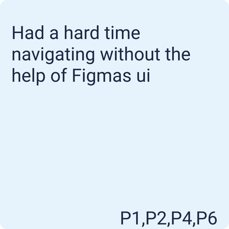
I ran card sorting tests with my coworkers at the LEGO Group to ensure new users could easily find information. I wasn’t designing for myself, so their feedback was key to making the layout more intuitive and user-friendly.
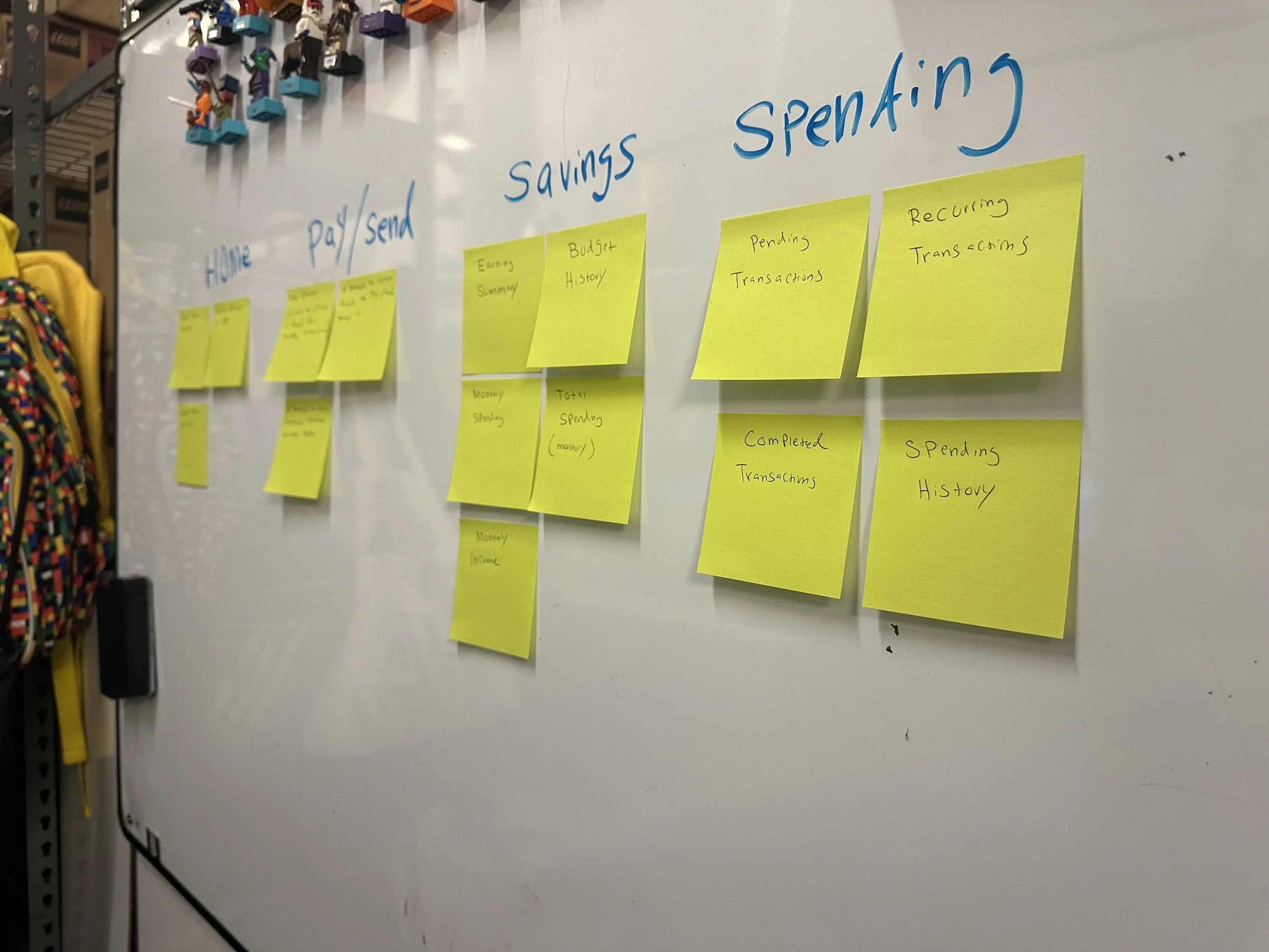
Sitemap
II took the initiative to map out the entire app in Figma, laying out all the key screens and features. It’s like a blueprint that makes everything easy to see and connect!
The team felt a subscription model didn’t align with the app’s "simple, on-the-go" brand and raised trust concerns. I removed the feature for now but will consider it for future projects.

DEVELOP

Prototypes
I built a Figma prototype with the app’s core features and had friends and colleagues test it on my phone. Their hands-on feedback was invaluable in refining the design!
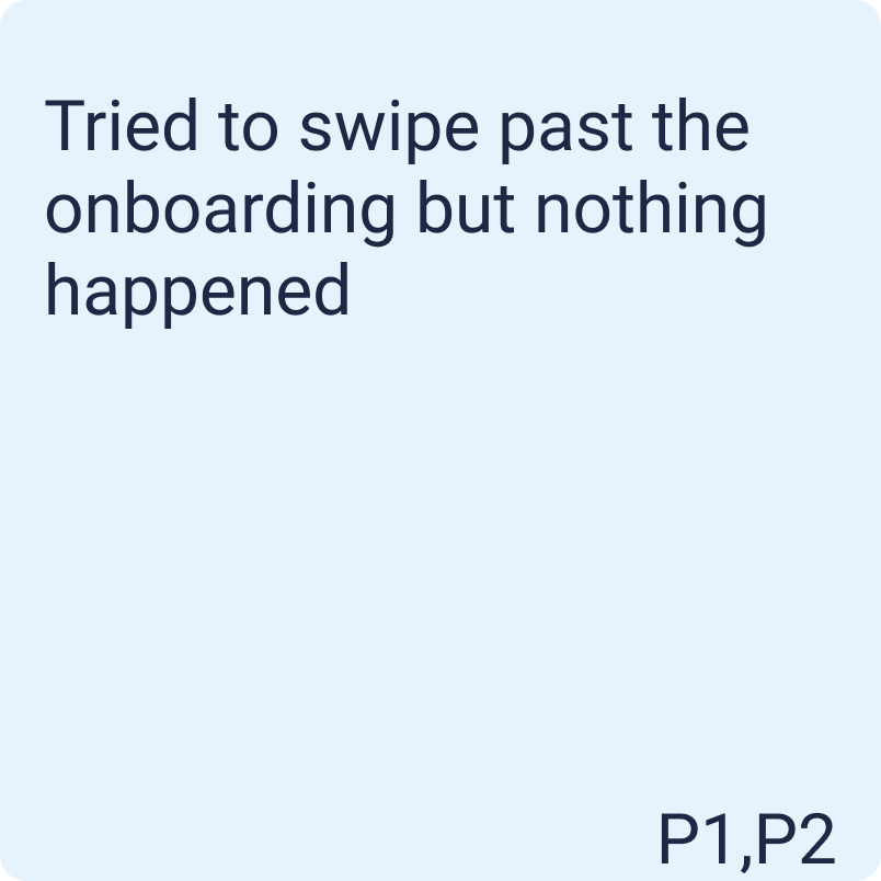
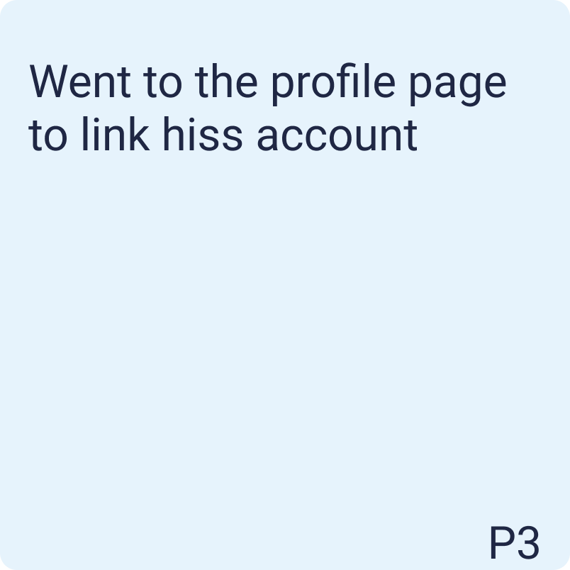
User Testing
User tests made one thing clear—the app was more maze than map. So, I revamped most screens, taking cues from competitors and leaning into Google’s design principles to make navigation smoother and more intuitive.


DELIVER

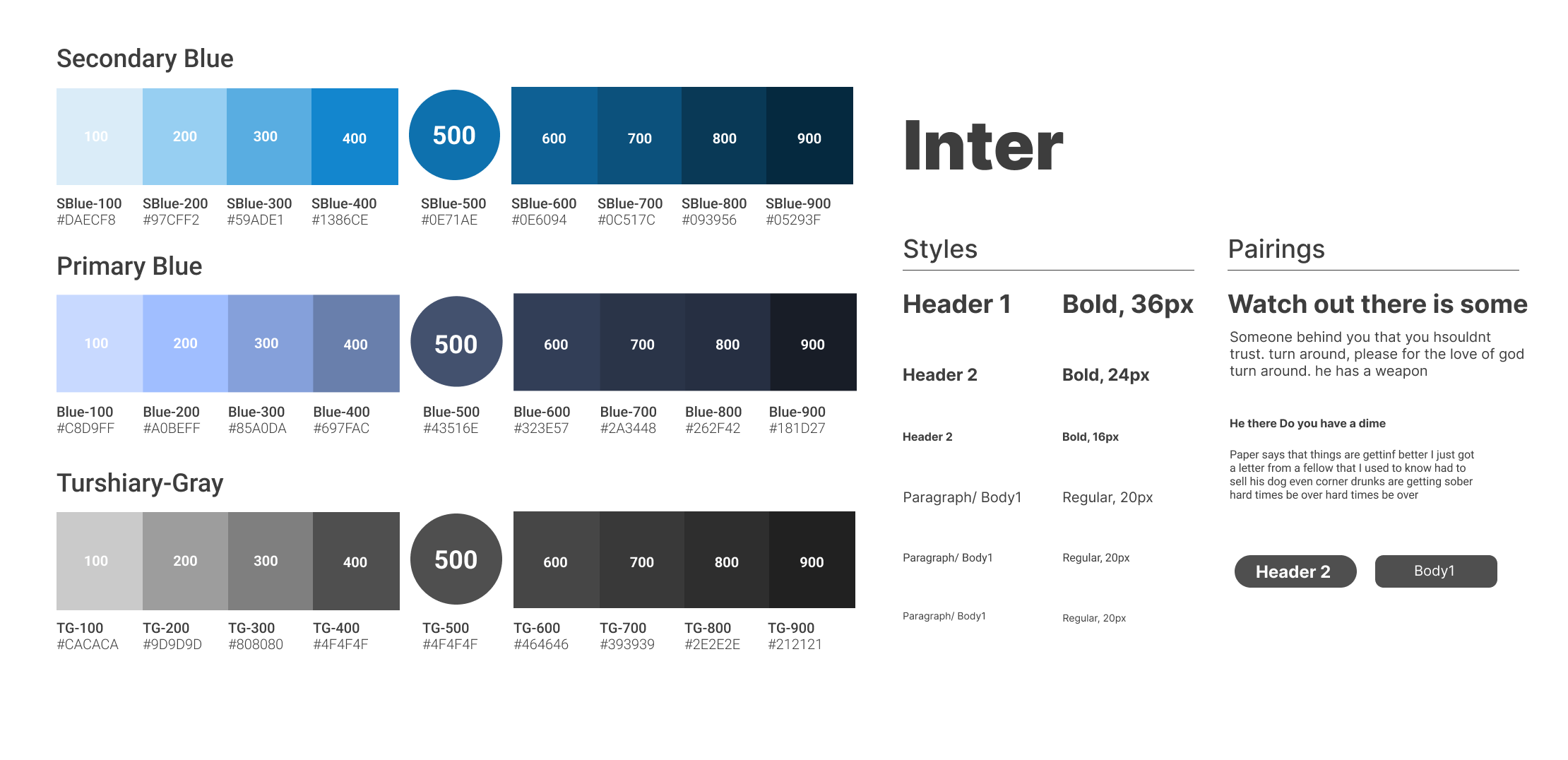
Style Guide


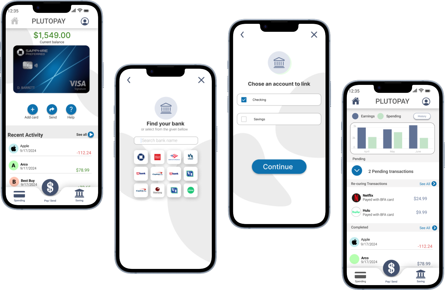
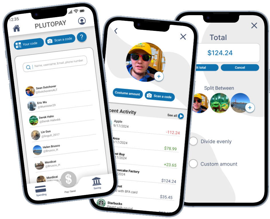
Sending

Final Design
The onboarding screens guide users from login to the main home page, allowing them to skip the process for greater convenience while ensuring quick log in and log out with clearly framed buttons to encourage interaction.
Sending money is simple with quick access to your recent purchase history. Splitting totals is easy, too, thanks to our group creation feature. You can quickly choose to split the payment evenly or manually enter amounts for each person.
Home
The home screen guides users to key actions like adding a credit card or sending money, all with simplicity in mind. I used blue to create a calm vibe for financial decisions, and followed Google’s Material Design to make the layout intuitive and user-friendly.
Learnings
This project taught me a lot about the design process. The real-world experience of talking to users and getting feedback was both fun and valuable. Looking back, I realize I could’ve done more research on similar products to learn from their design choices. I did some initial research, but diving deeper would’ve definitely helped.
Going forward
I’m happy with where PlutoPay stands, but if I could, I’d gather more feedback, test, and refine the core features until it’s seamless and easy to use. I’d also explore a subscription model and research how crypto could fit in—it seems like a promising niche for the market.